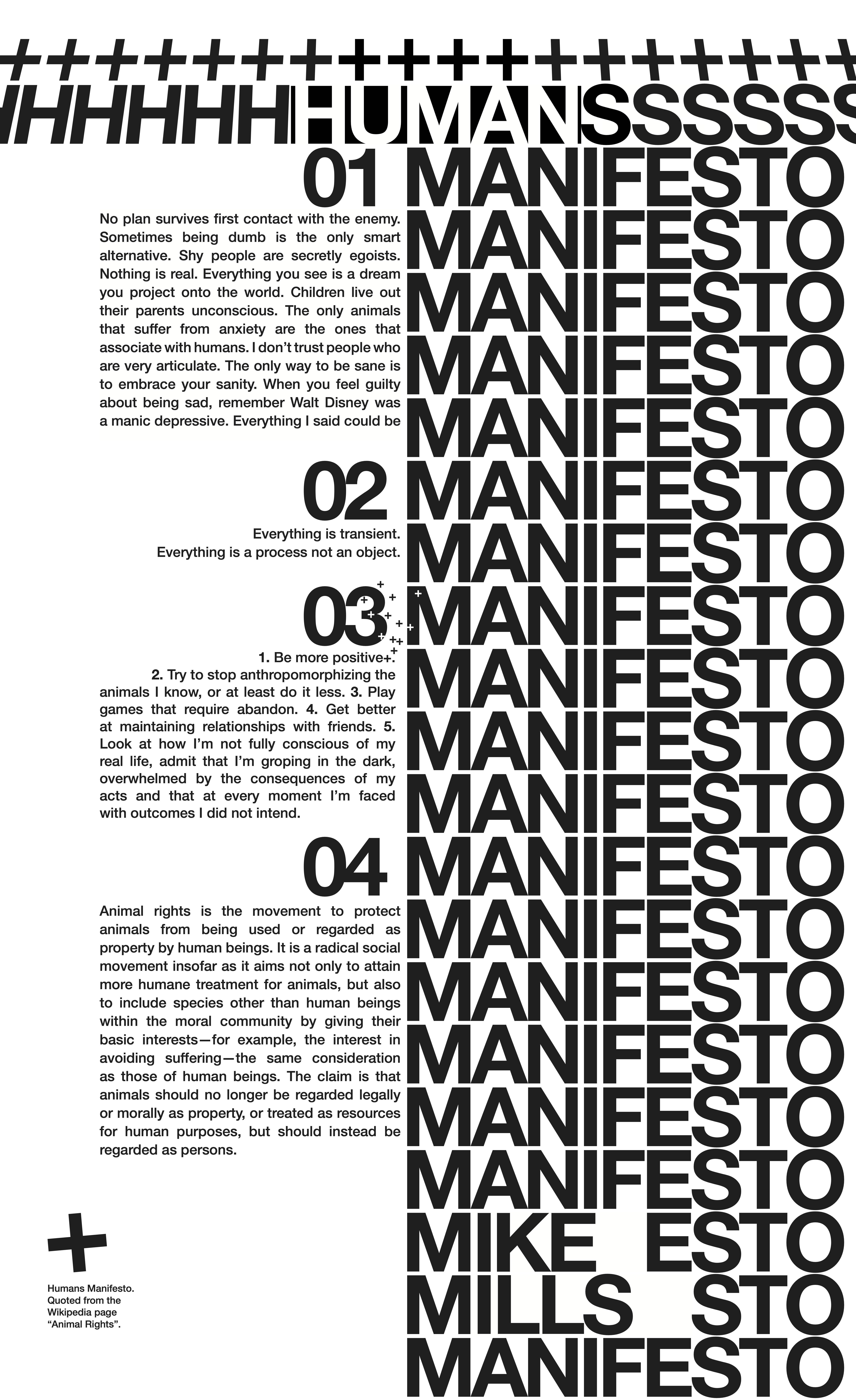
Beatrice Warde, in her influential article “The Crystal Goblet,” argues type should be transparent, serving as a clear vessel that offers an unobstructed view of the “wine” inside, or in our case, the printed words on the page. This poster explores that relationship – should form always follow function? This typography project builds around the manifesto written by Mike Mills. Original size: 26 cm x 43 cm.
